A good navigation system is like a map that shows your site visitors exactly where to go to find what they are after. Luckily, creating WordPress menus is an easy process because the platform provides an intuitive and user-friendly system for creating menus.
There is also a problem. WordPress does not provide any options to upload an image for your menu item. It means that it is not possible to display any image in the menu item by default.
On the other hand, WordPress allows to add a custom CSS class to menu items. It means that we can use a custom CSS to add a custom image to the menu item.
Display a custom image using CSS
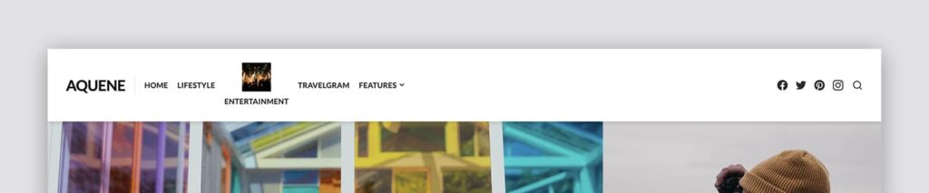
I am going to use Aquine, one of our professional themes for WordPress, as an example for illustrating this process of customization.

Note, I’ve already added a custom CSS class to the menu item which I want to customize. I’ve decided to use menu-icon-show as my custom CSS class for the menu item.
So, make sure to add a custom CSS class to your menu item as well before proceeding to the step below.
Next, we need to add a custom CSS to the site. Otherwise, WordPress will not know which image we want to show in the menu item, and and which menu item we want to customize.
Here is my custom CSS:
.menu-icon-show::before {
    content: "";
    display: block;
    margin-left: auto;
    margin-right: auto;
    margin-bottom: 0.5em;
    background-image: url(https://example.com/my-image-icon.jpg);
    background-repeat: no-repeat;
    background-size: 50px 50px;
    width: 50px;
    height: 50px;
}
In this example, I am using the image which has size: 50x50px. You can see size values in the custom CSS above. Modify them if you want to have a different size.
Note, the custom CSS above will apply this style change made to your menu items in all device views. It means, that a desktop version of this menu item will be the same as a mobile version.
You can use CSS media queries to modify elements on your site depending on a device’s screen size. Here is an example of the custom CSS to display a mobile menu image only for desktop views in Aquene:
@media (min-width: 992px) {
    .menu-icon-show::before {
        content: "";
        display: block;
        margin-left: auto;
        margin-right: auto;
        margin-bottom: 0.5em;
        background-image: url(https://example.com/my-image-icon.jpg);
        background-repeat: no-repeat;
        background-size: 50px 50px;
        width: 50px;
        height: 50px;
    }
}
Solution with a custom CSS does not work
The are cases when the solution above might not work. If the custom CSS you’ve used for your menu item does not work then it’s possible that your theme overrides your custom styles.
- If you are using a free theme from WordPress.org then please post your support request at WordPress.org support forum.
- If you are using one of our themes, please contact us using the link located in the site header.
- If you are using the theme other vendor, please contact the author of your theme for support.
Make your site look its best with Themes Harbor
To unleash more of the potential of your WordPress site and give visitors a great experience, however, you will need to use a professional WordPress theme.
Themes Harbor enables you to create a human-centered and future proof website for your audience using a professional WordPress theme.
Leave a Reply